|
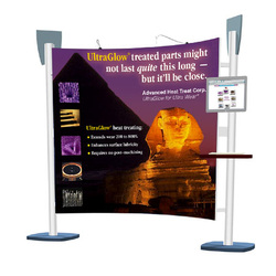
By Paul Bridson  HERE ARE the basic principles our award-winning designers use to create graphics that work! 1. Make them stop and look In just three to five seconds, graphics should communicate who you are, what you do and how customers can benefit. Graphics are the first impression an attendee has of an exhibitor at a trade show, so it is important to make the right statement. 2. Consider your show goals Consider how to convey your show goals graphically. Aim to grab attention with full-blown, interesting and vibrant graphics. Make graphic images life-size or greater for the highest impact. 3. Project the right image Understand what image you want to project: traditional, hi-tech, dependable, etc. Your company's image will dictate choices in typefaces, artwork, color, etc. 4. Design for the audience Design your graphics to your target audience. Focus on customer benefits. Use your graphics to show how your company differs from the competition. Design images to stimulate your viewer's imagination to think beyond the con- ventional. Avoid designing down to particular audiences, e.g. white for doctors, diagrams for engineers. Convey technical information using good design principles and carefully planned graphics. 5. Use different types of graphics There are a variety of graphic solutions available including front and backlit photographs, digitally printed images, murals or detachable signage. Your trade show consultant can also show you how you can build dimensionality into your graphics, using standoffs or spacers. 6. Have an integrated approach Plan to use your graphics on other collateral material for a thematic, integrated look. For greater memorability, use color rather than black and white. 7. Use light If you don't adequately light your graphics, you may as well not have done them. Lighting is one thing that's hard to overdo in a trade show display. 8. Include special effects Pull in your audience with graphics coupled with other effects. Attract attention with movement. Consider adding an LED message sign to your display, adding motion or using 3-D imaging. 9. Limit copy Limit the total amount of copy as people rarely spend time reading a mass of type on a graphic panel. Use simple language. Write copy in short sentences and keep your paragraphs short. 10. Avoid Superlatives, or the "brag and boast" syndrome, clichés and overused metaphors, superimposing copy on your illustration or reversing out large amounts of copy (white type against a black background), and periods at the end of headlines as they stop the reader from reading any further.
0 Comments
Your comment will be posted after it is approved.
Leave a Reply. |
800-760-7706Paul Bridson and Kelly SargentWe've been helping companies achieve lofty goals for over twenty years now. Here's the benefit of our experience! Archives
July 2018
Categories
All
|


 RSS Feed